
This flag represents our movement around the world. It has a lovely origin story and a beautiful meaning. We hope that more people will use this flag and we are selling merchandise here.
We did some research and interviewed the designer. Here’s what we learned.
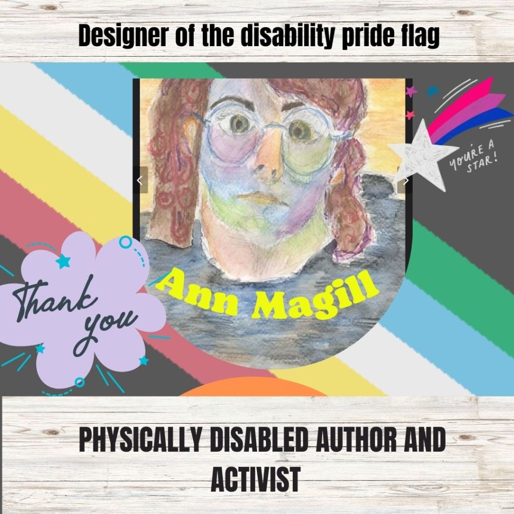
Designed by Ann Magill, a physically disabled artist.
Ann has cerebral palsy and lives in Virginia, United States. She tries to avoid big corporate social media but can be found on tumblr, (Capricorn-0mnikorn), Dreamwidth (capri0mni) and reddit (Capricorn-0mnikorn). She generously waived all copyright to the flag

Outside and Above Ground
“Ever since I attended the local “celebration” of the 20th anniversary of the Americans with Disabilities Act in 2010, only to find disappointment that the celebration was confined to the basement and grounds of the regional Independent Living Center, instead of out in the public, I’ve wanted a Disability Pride Flag.” Says Ann Magill
Galvanised by tragedy
In 2016 Ann was ” driven to design an actual flag, instead of just wishing we had one.” Disability pride was her answer when a terrorist murdered disabled people in a hate crime in Japan. In his manifesto he said we needed to be euthanised for the sake of the country and world peace.
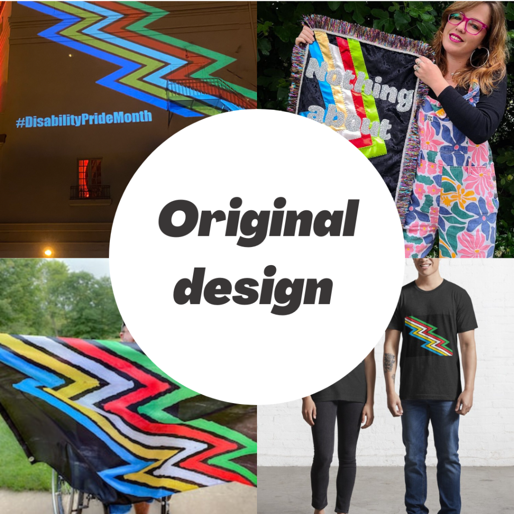
The original design was embraced by the community
It included a lightning bolt design to represent creatively navigating obstacles and living lateral lives. In the picture you can see the original flag displayed on a wall, worked into a quilt by artist Amy Claire Mills, being sold on Etsy by Handcut company , and being sold on merchandise on RedBubble by Uniqueitems
Working together to be more accessible
The strobing effect of the lightning bolt design was triggering to people with certain visual and neurological disabilities. So, in a true act of solidarity, Ann sought feedback from the disability community and together with them she came up with a new design that was more accessible

Breaking out of the box
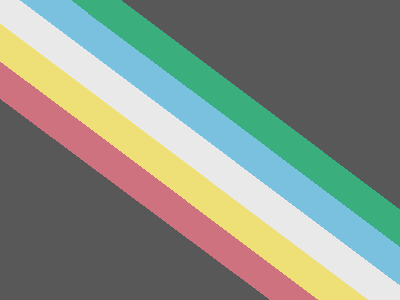
Downward sloping diagonal lines are pretty rare on flags. They exist in only one country on earth. They are also the opposite of the flat and square walls, ceilings, windows, and other physical and mental barriers that keep us boxed in. Ann Magill tells us to think of the parallel sloping lines as like “someone breaking through a door with a crowbar” , demolishing the “walls and ceilings that keep us boxed in”
Parallel lines close together for solidarity
A vital part of disability pride is unity and mutual support as a community of disabled persons regardless of our differences. The stripes close together represent a closeknot community of different disabilities
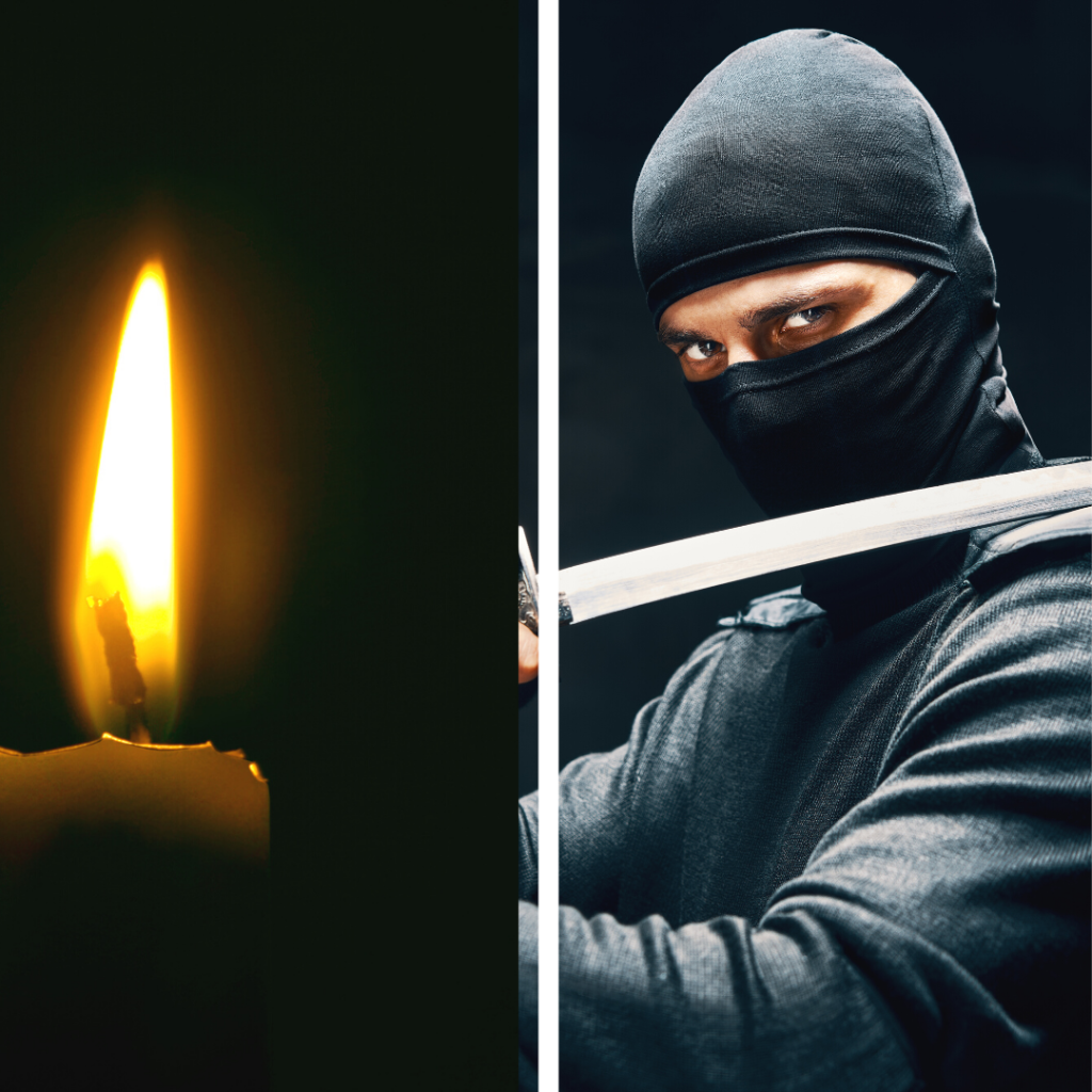
Black for oppression and for resistance
Black is the colour of mourning but it is also the colour of ninjas and resistance. This dual meaning of the black flag reflects the two sides of the disability pride movement: recognising and protesting the evil, and fighting for pride in the good instead
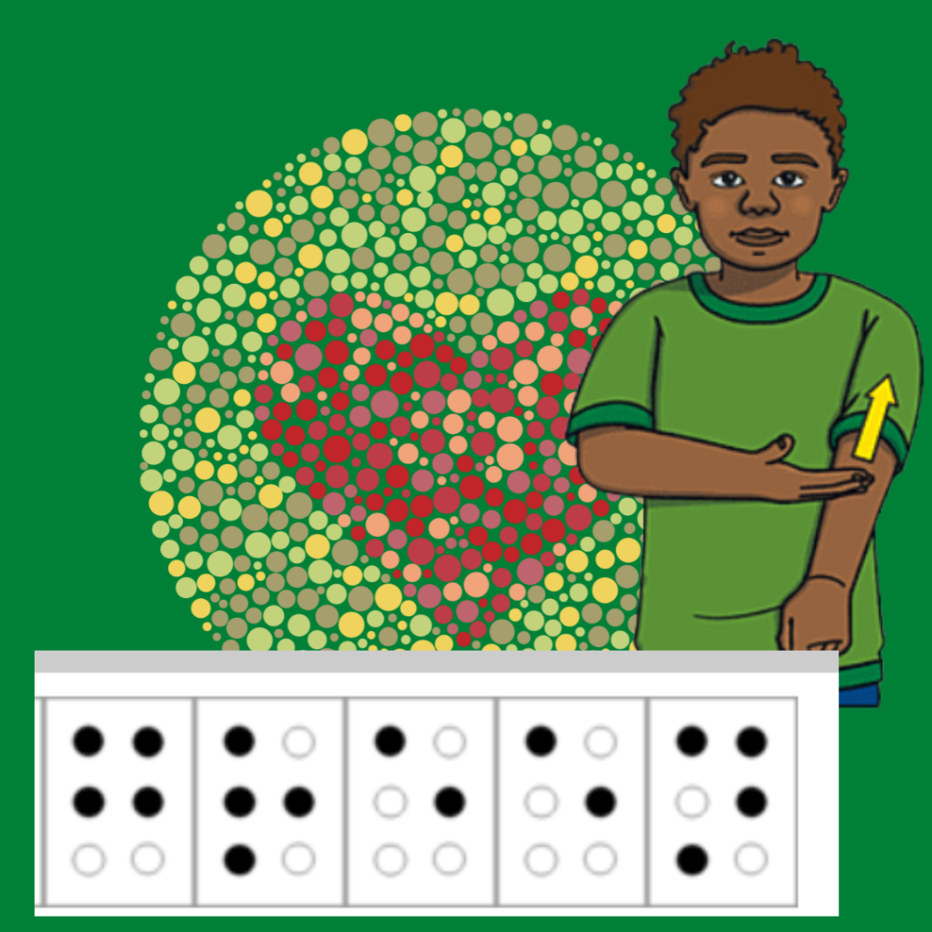
Green for sensory disabilities
Sensory disabilities include low vision, deafness and the like. The most common type of vision impairment is red-green colourblindness, affecting 8% of men. In the picture we see someone making the Auslan sign for green and the braille for green as well as the test for red-green colourblindness.
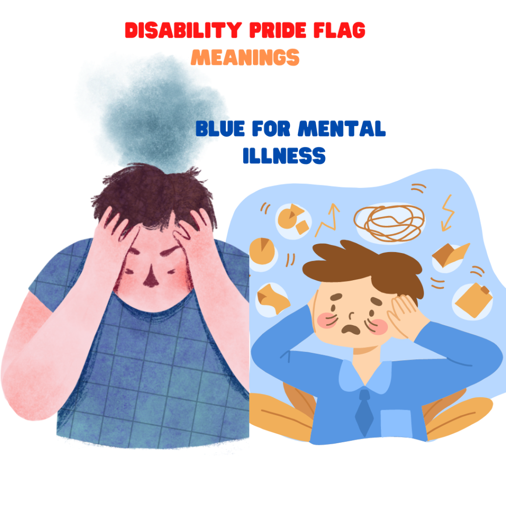
Blue for mental illness
Blue is traditionally associated with the mind and with depression.
White for invisible and undiagnosed disabilities
This is a good colour to have in the middle, because almost every disability falls under this category at some point. At the very least, many of us have some misunderstood or invisible symptoms
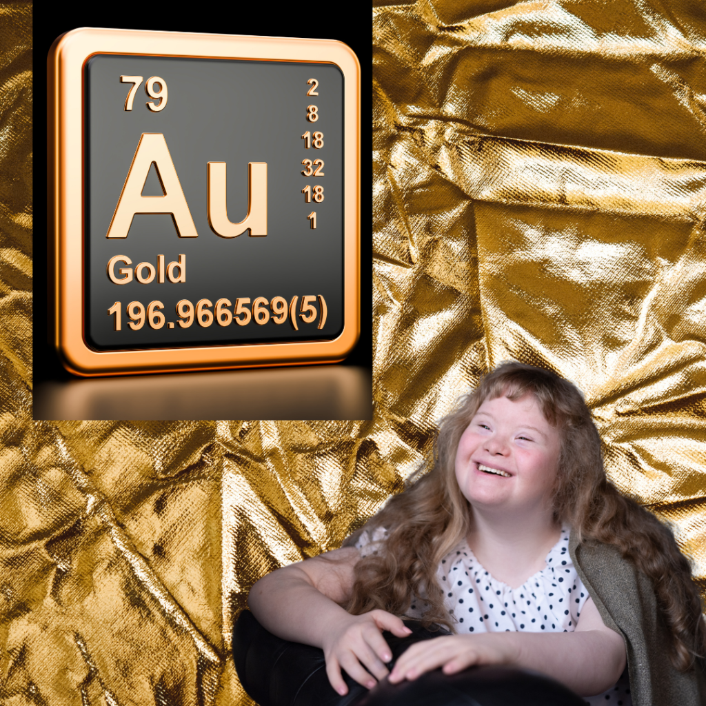
Yellow for neurodiversity
The chemical symbol for gold is “Au” so this stripe represents neurodiversity. But it goes further than the disabilities most commonly associated with neurodiversity to embrace all brain and mind differences from cerebral palsy to brain injury.
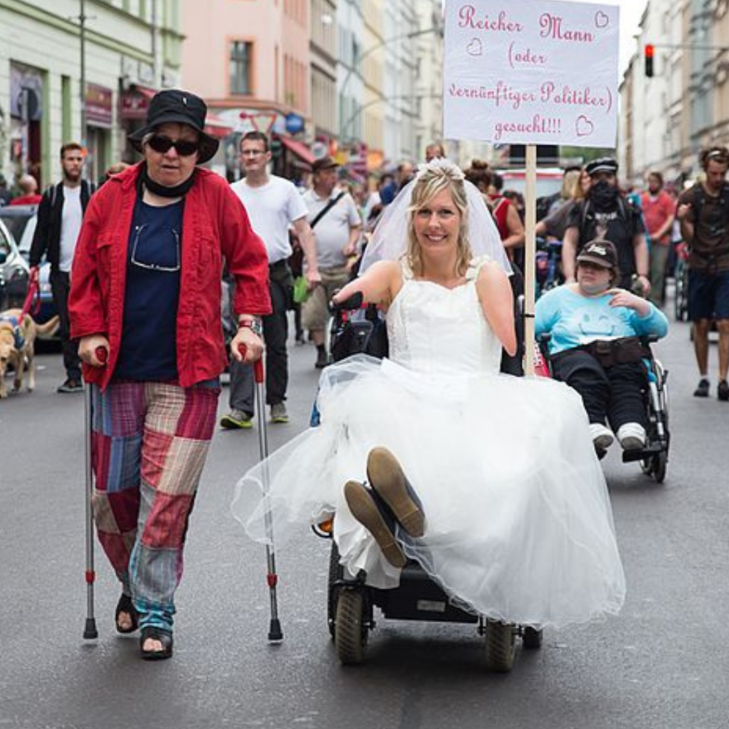
Red for physical disabilities
For centuries, the colour red has been associated with flesh and blood in flags and logos. Here we have two very proud individuals at the Berlin disability pride parade. Photo by Montecruz photo